We’re not here to be safe. We’re here to be unforgettable
OVERVIEW
Lesedi FM is one of South Africa’s most established radio stations, deeply rooted in the Free State and the Basotho community. The brief was not just to refresh the visual identity but to reposition the station for a new era. One that honours its legacy while making it relevant to a younger, digitally connected audience.
This was both a brand evolution and a cultural responsibility.
THE CHALLENGE
The station was widely respected but increasingly perceived as being for an older audience. At the same time, Lesedi FM was introducing a digital streaming offering, allowing listeners to tune in from anywhere.
The task was to modernise the brand, attract a younger audience, and communicate its new accessibility without losing the trust of loyal listeners.
Insight & Concept
Lesedi means “light”.
Light travels. Light connects. Light reaches everyone.
This became the foundation of the brand, both conceptually and visually.
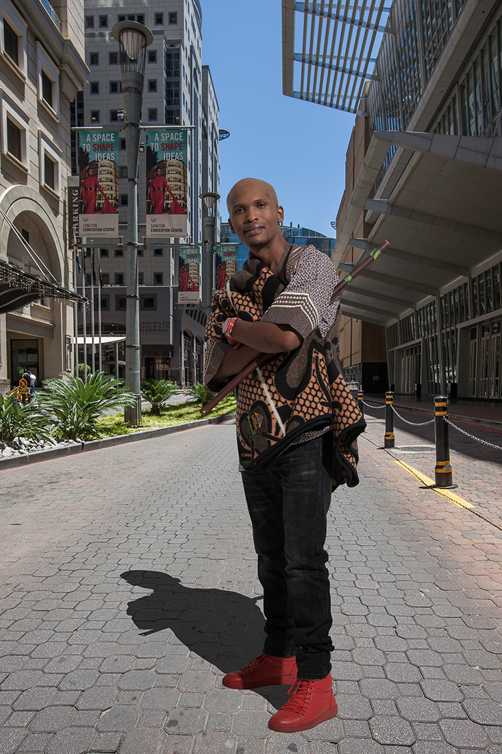
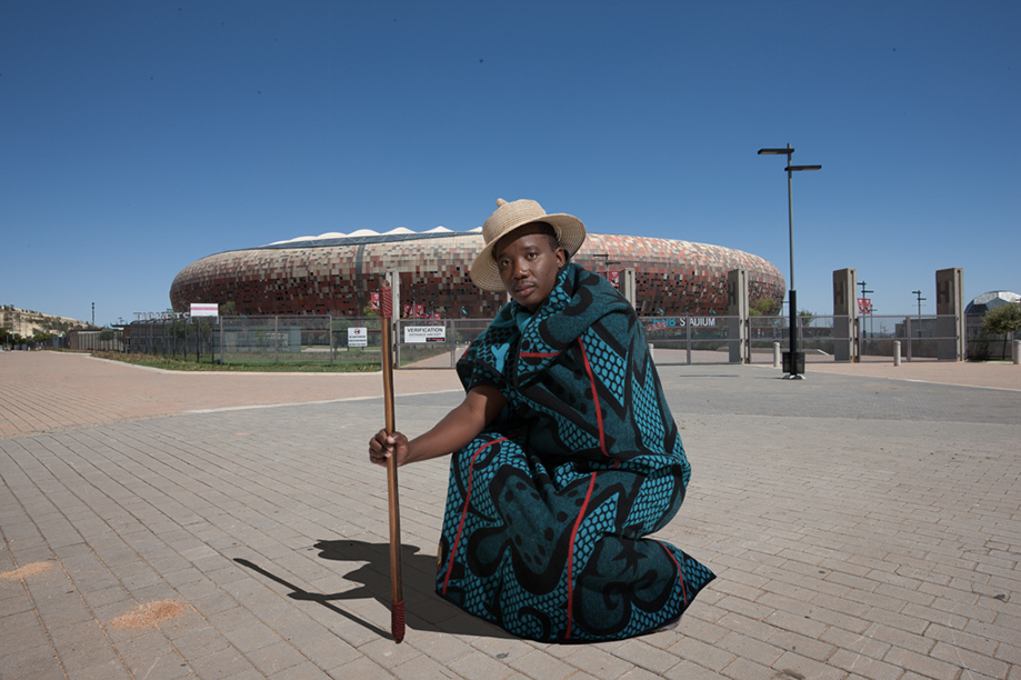
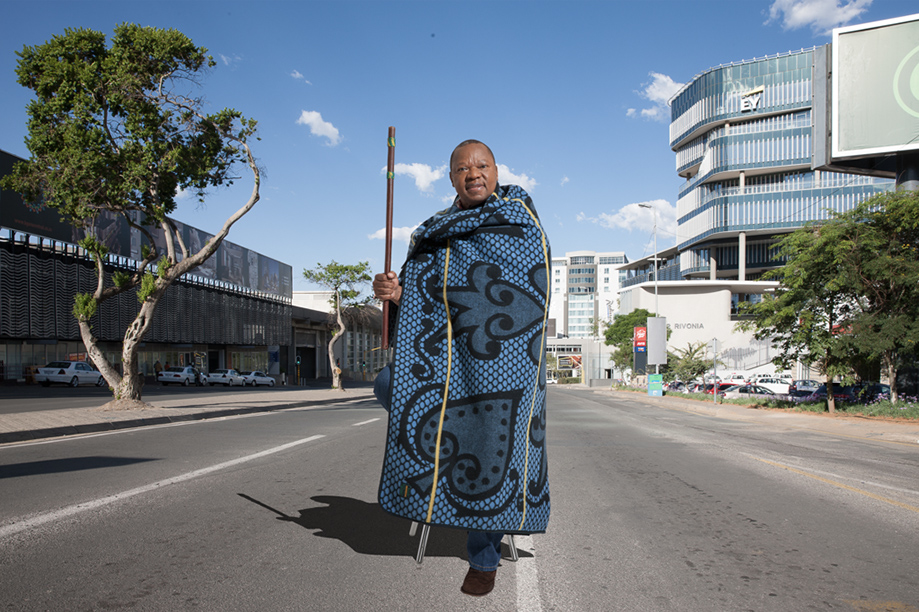
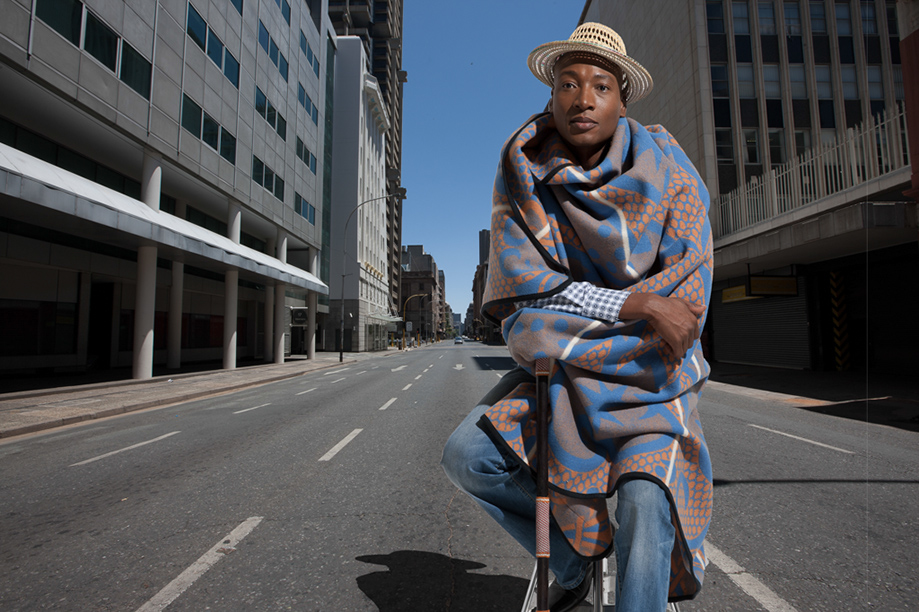
The logo was crafted from three meaningful elements: the Basotho hat as a symbol of heritage and identity, the radiating sunrays representing light and broadcast, and the agricultural landscape of the Free State grounding the brand in its people and place.
Together, these elements create a mark that expresses connection, reach, and belonging while remaining distinctly rooted in the culture.
Campaign Idea
To bring the repositioning to life, the campaign focused on connecting without boundaries.
A young couple shares a dinner date while in different cities, connected through a video call. Both are listening to Lesedi FM, making the station the emotional thread between them.
This idea communicated the digital offering while naturally positioning the brand within a younger, more modern lifestyle.
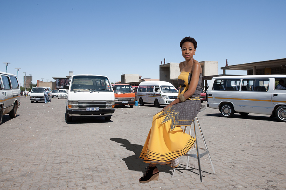
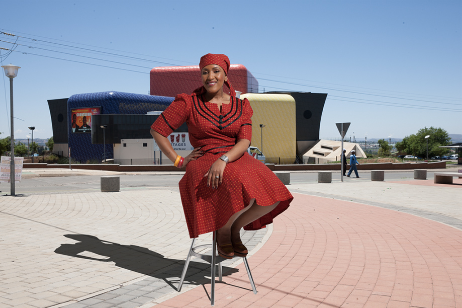
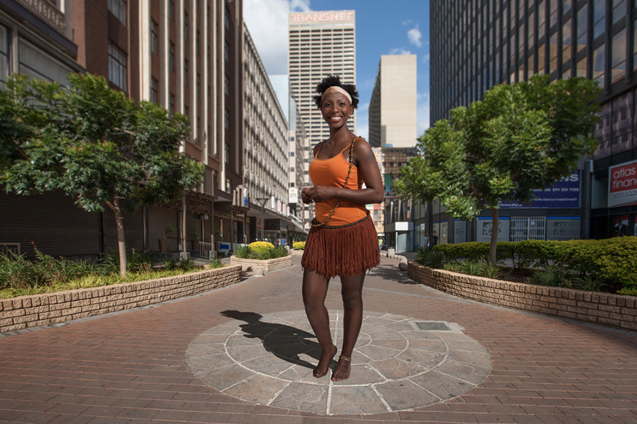
The repositioning expanded the brand’s relevance across generations. Lesedi FM became a station that speaks to both young and older audiences, reflecting a diverse music offering that ranges from jazz and gospel to contemporary and dance.
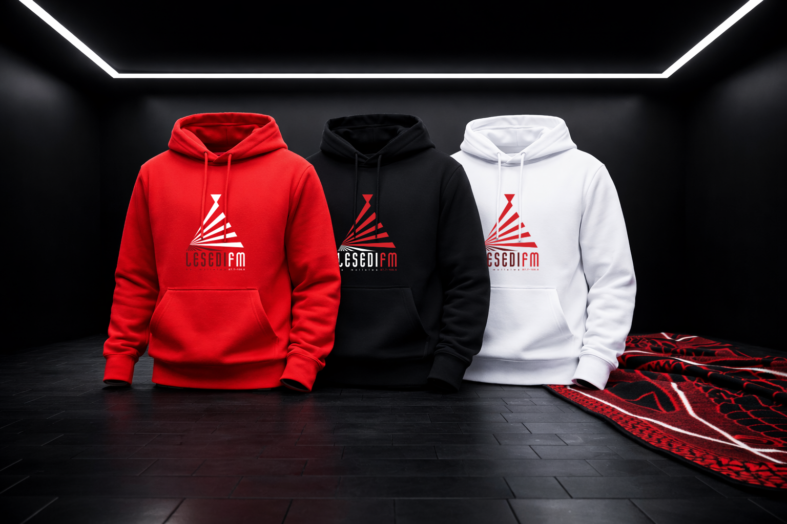
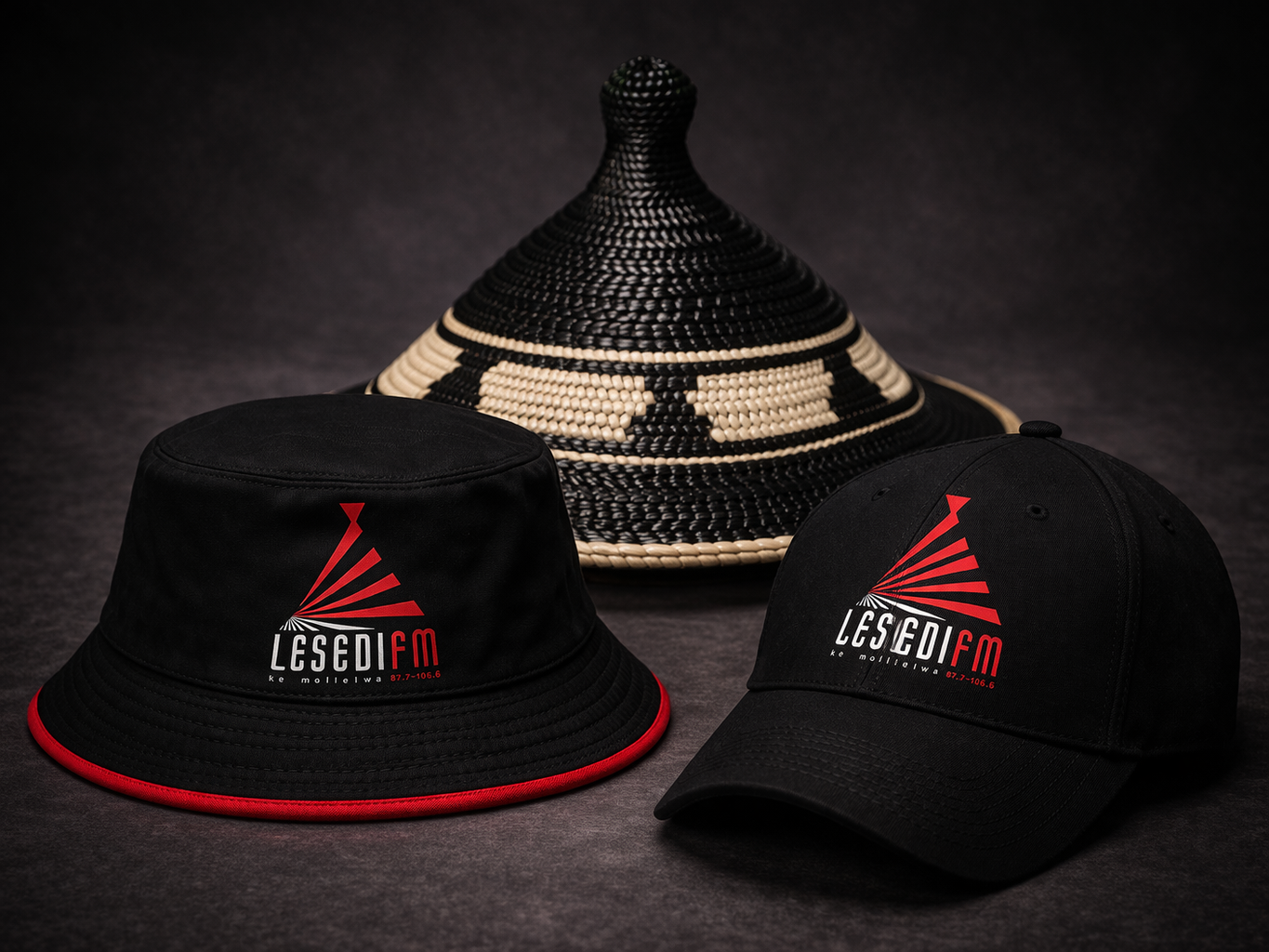


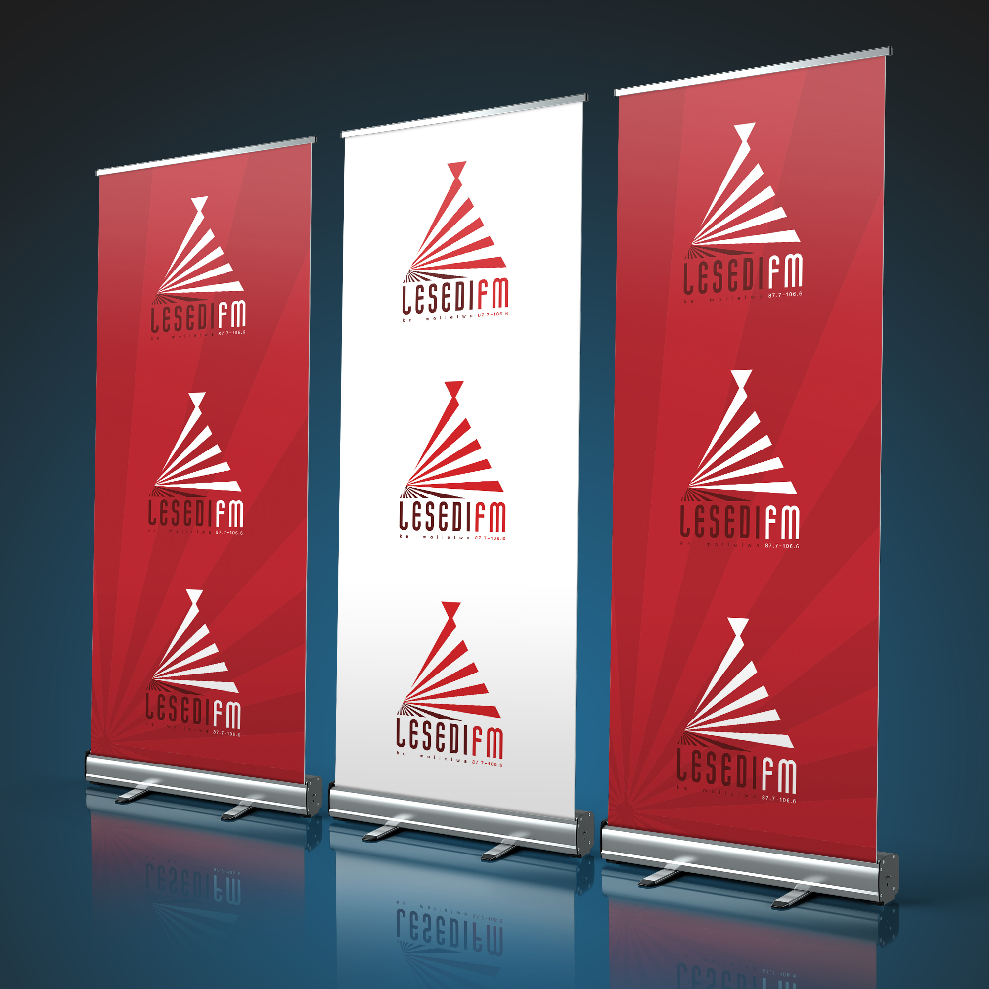


Identity System
The identity was designed to balance modern energy with cultural authenticity.
The colour palette plays a key role. Red brings boldness, confidence, and visibility, ensuring the brand stands out in a competitive media space. The darker tones at the base of the rays represent soil, grounding the brand in the agricultural richness of the Free State and symbolising the resilience and rootedness of its audience.
This system ensures consistency across all touchpoints while maintaining a strong emotional and cultural connection.
Outcome
The result is a brand that feels culturally authentic, visually confident and digitally relevant.
Lesedi FM evolved from a station you listen to, into a brand you live with. The repositioning successfully broadened its appeal, allowing it to connect with a younger, more digitally engaged audience while maintaining deep loyalty with its core listeners.
This shift translated into real impact. The station not only strengthened its dominance in its heartland, ranking number one in the Free State, but also expanded its influence beyond provincial boundaries, achieving a number two ranking in Gauteng, one of the most competitive radio markets in the country.
This growth reflects a brand that is no longer defined by geography alone, but by its ability to connect people across regions, cultures and generations.